The need to make websites mobile has become a basic tenet of digital marketing. It’s also recognized that the healthcare industry has a particular need to excel in this area, given how often someone seeking medical services is doing so on their phone and looking for immediate help. Not every office has a digital expert on staff, so when asked, “How do I make my website mobile-friendly?”, here are some introductory pointers we can offer.
Use a responsive template.
If you don’t get this one right, everything else will be lost. When you choose a template for your website, you can easily pick one that will adjust based on the device that’s accessing it. This alone won’t ensure your website passes Google’s mobile-friendliness test, but it at least gives you a fighting chance.
Use easy-to-read font.
Your fonts need to be dark and large enough to easily read. Choosing a small font with a lighter color isn’t the smartest thing to do for a desktop. With a mobile device being more difficult to consume content on, it’s digital suicide. A person using their phone has to be able to read your content without straining.
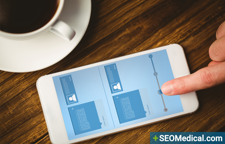
Simplify the presentation.
Perhaps you have a lot of information that you can jam on your home page. It’s great that you have it—valuable content means your website has something to offer. But you don’t need to put it out there all at once. Keep the home page simple with just enough graphics to make it appealing, but not so many as to create clutter. That will make it easier to scroll through on a mobile device.
Make sure your graphics are responsive.
Do you have a nice banner with your practice name and logo? You need to have your designer ensure that the artwork itself is responsive. We’ve seen it happen—a nice mobile website gets created, but the banner is forgotten. The result is someone pulls up the URL on their phone and the banner is completely disjointed from the rest of the content.
Know what information mobile-users look for.
You can use Google Analytics to segment your data between desktop and mobile users. From there, you can see what particular pages are popular among mobile users. Make those easier to access—perhaps they can be on the menu or maybe you can just have a section of the home page called “Helpful Links” that will quickly take the mobile user where they want to go.
Test, test, test.
Have people outside of your office get on their phones and check the new website. Friends and family are natural choices, although make sure they give you real feedback and don’t just cheerlead. Get the feedback from multiple sources across a demographic spectrum.